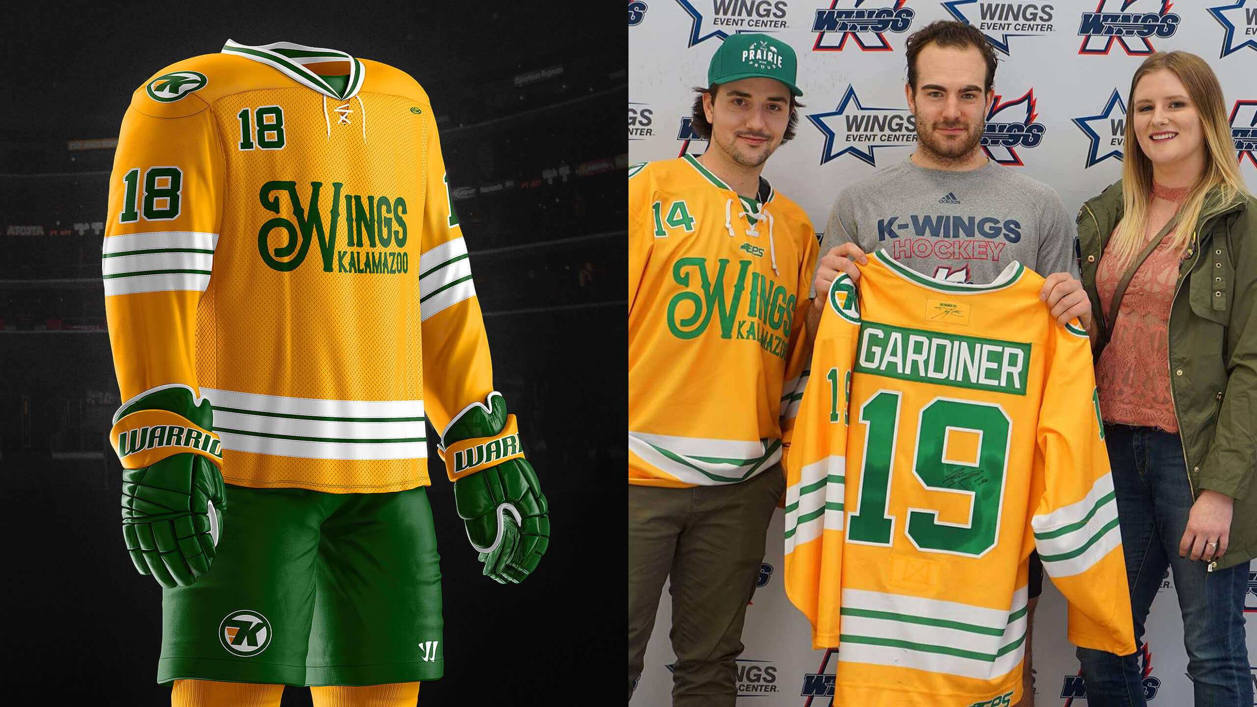
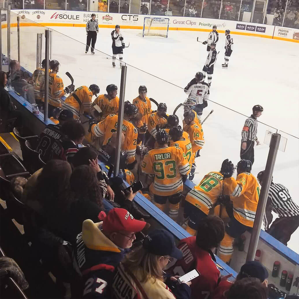
Five years. I recently realized that the month of December 2018 marked five years since I started creating hockey jersey concepts. Fast forward 5 hockey seasons, and I can now say that a professional hockey team has worn a hockey jersey that I designed. On December 8th, the Kalamazoo Wings of the ECHL took to the ice wearing a yellow and green ensemble that originated on the screen of my MacBook Pro, the very same screen that my first ever hockey jersey concept came from 5 years before.
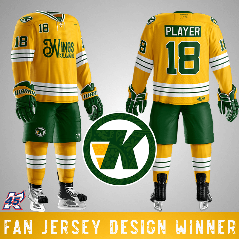
This past July, I entered the annual Fan Design Jersey Contest held by the Kalamazoo Wings. I chose to make my contest entry yellow/green, instead of the K-Wings current color scheme of red/blue. I based this choice off of the organization’s past affiliation to the Minnesota North Stars in the late 80’s. I knew that staying away from red/blue would help make my design stand out, and differentiate me from the crowd.
In addition to this, the jerseys were meant to be a small tribute to the Humboldt Broncos; whose bus tragedy earlier this year happened less than an hour
from my house. The team chose the top 10 designs, and then a fan vote determined the winner amongst those 10 designs. In early August, I received a call from the Kalamazoo Wings informing me that I had won! In addition, they were going to fly me out to the game in December to see my jerseys in action. On December 7th, my wife and I left our home in Saskatoon, Saskatchewan, Canada and headed to Michigan, a state that neither of us had yet been able to visit. It was a truly amazing experience seeing my jerseys in action on the backs of a professional team, and
something I won’t soon forget.


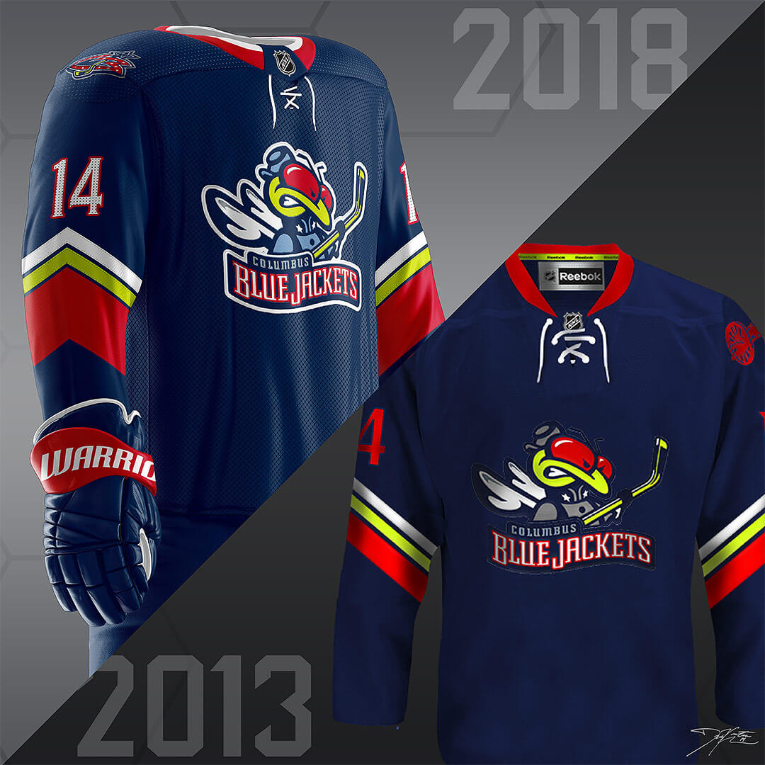
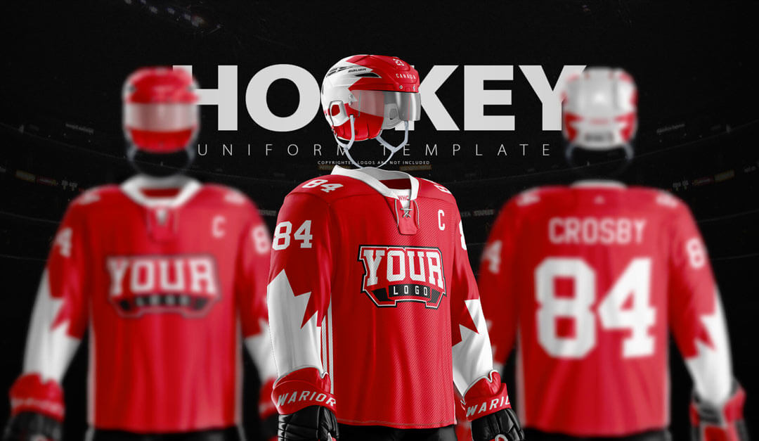
In a recent Instagram post, I took the opportunity to mention a handful of websites, designers, and companies that have helped me out tremendously in getting to the design level that I am at now. Next to Icethetics (the site that got me into jersey design in the first place), I have to give the most credit to the incredible 3D templates created by Ali at SportsTemplates. Along with every designer who uses his templates, they took my designs to a whole new level. SportsTemplates makes it possible for you to see nearly exactly what a jersey would look like in real life; you
don’t have to leave much to the imagination. Don’t get me wrong, there is often still a large discrepancy between high quality and a mediocre design, but SportsTemplates pushed every designer’s level of quality and realism up tenfold.


When I was asked to write this blog post, Ali wondered if I could include some possible tips for new designers to take their creations to the next level. By no means do I think that I am the best, and there are still plenty of current hockey designers that I think are a step above me and that I look up to. That said, I do consider myself at a pretty high level, and now I have some accolades to back it up. I think that the best advice that I have to offer could be summed up in three words: Practice, Details, and Believability (in that order).
Practice
As with anything in life, the only way to get better is to practice, practice, practice. After 5 years of dabbling in jersey design, I think that it’s only been in the last 1 to 1.5 years that I have really taken myself to an “elite” level. Some of my earlier designs looked awesome to me then, and make me cringe now. I’ve often said that one of my favorite parts of designing jerseys is that I’ve always felt that my best designs are my most recent ones.
Details
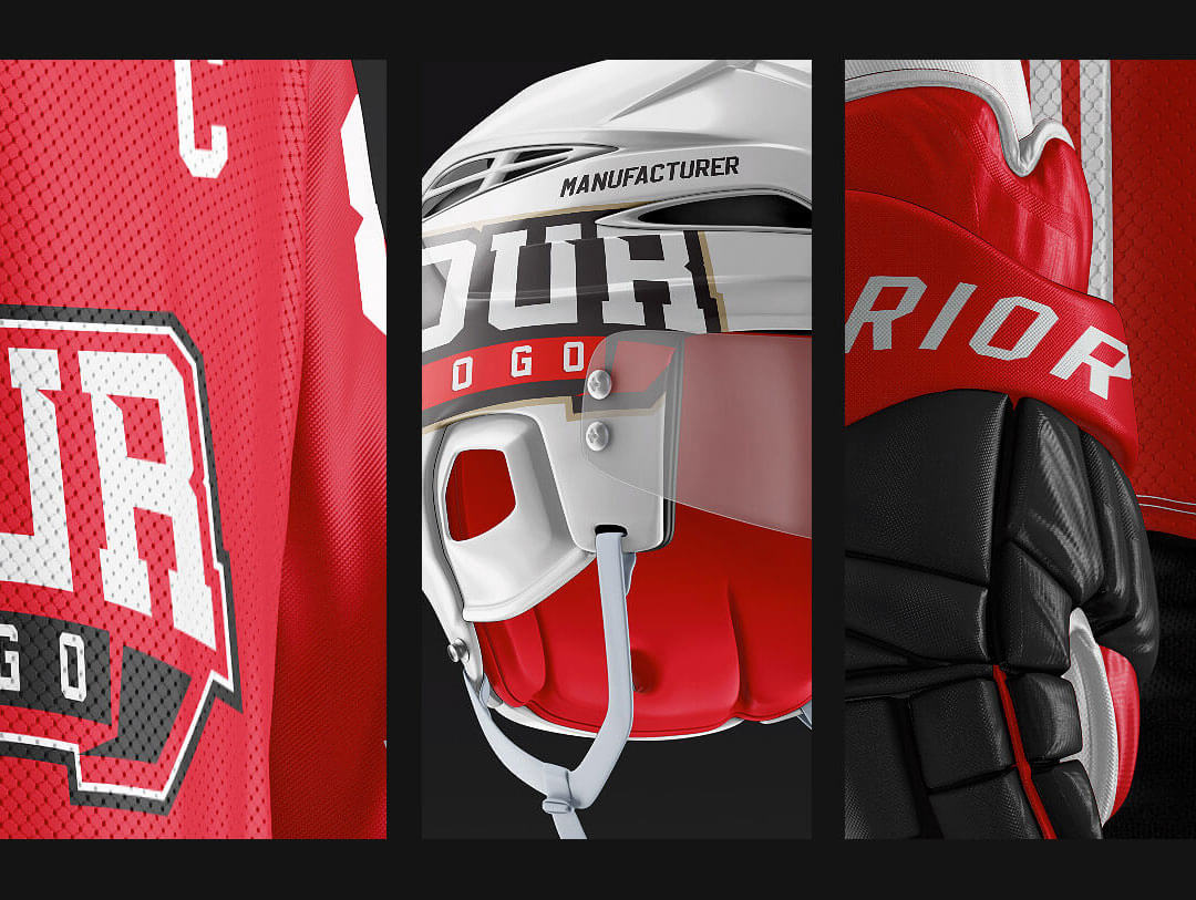
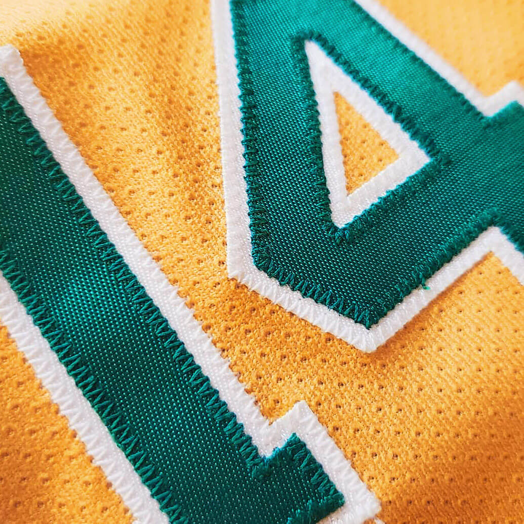
In my opinion, the biggest differentiator between a “good” and “great” jersey concept is in the finer details. Figuring your own unique way of including stitching, embossed logos, etc, will put you another big step ahead of 90% of the other designers out there. A great place to start if you want to look into this further is to check out Dylan Nowak’s videos on YouTube. The methods that I use are a little bit different, but Dylan’s videos are great step-by-step instructions on how he does it. He’s also definitely worth a follow on social media; one of the very best in hockey design. Another very important part of attention to detail is proportionality and placement. If you’re a big fan of hockey jerseys and appreciate all of the details and intricacies about them, you’ll know how quickly overly small numbers or a crest logo that is too low (both something that seems to come up a lot) can ruin a jersey, as well as make the designer appear less advanced. Take your time doing research before you make a concept. If you’re making an NHL concept, look up the current Adidas jerseys and take note of the placement and proportionality of
the numbers, logos, etc.
Believability
This one is interesting because it’s a little less obvious, and something that I think is often overlooked in sports design. If you’re a reader of any websites that have ratings or voting on sports jersey concepts, you’ll probably notice that very often the highest rated and most praised jerseys are ones that are usually pretty similar to the team’s actual jersey. As much as many of us (including myself) would love to suggest changes to some of the current team’s jerseys, remember that highly experienced and talented designers created them all, likely with input from several other people. Often the most widely accepted jersey modifications are minor ones. In other words, if you are doing a rebrand concept for the Philadelphia Flyers, including any colors that aren’t black, orange, or white, is probably going to get a poor rating, simply because there is no way that that franchise will ever not be black, orange, and white, at least on their primary jerseys. I don’t mean to stifle your creativity, but if you can find a way to show your personality while still creating something that could actually be considered by the team, you will be much better off. It’s not to say that you can’t make a cool looking purple Flyers jersey, but the reality is that the Flyers will never wear a purple jersey. Aside from color pallets, just keep your designs as believable as possible. The “scale of believability” of a design varies from team to team as well. For
example, if you’re making a new jersey for the Montreal Canadians (or any Original Six team), you have a lot less room to flex your creative muscles.
Brands like these have deep-rooted histories and simply wouldn’t entertain a total refresh. You won’t be seeing a red Habs jersey without the blue center stripe any time soon, I promise. Conversely, if you’re doing a 3rd jersey for the Vegas Golden Knights, very little is off limits! Aside from sticking to the color pallet, you can probably let your imagination run wild. Do your research!
If you want to get ahold of me for your team’s next jersey design, for any jersey design advice, or just simply to chat jerseys, please don’t hesitate to contact me via social media.
Dallas Kirkpatrick
@kirkpatrick14 (Twitter and Instagram)
@kirkpatrickdesigns (Instagram)