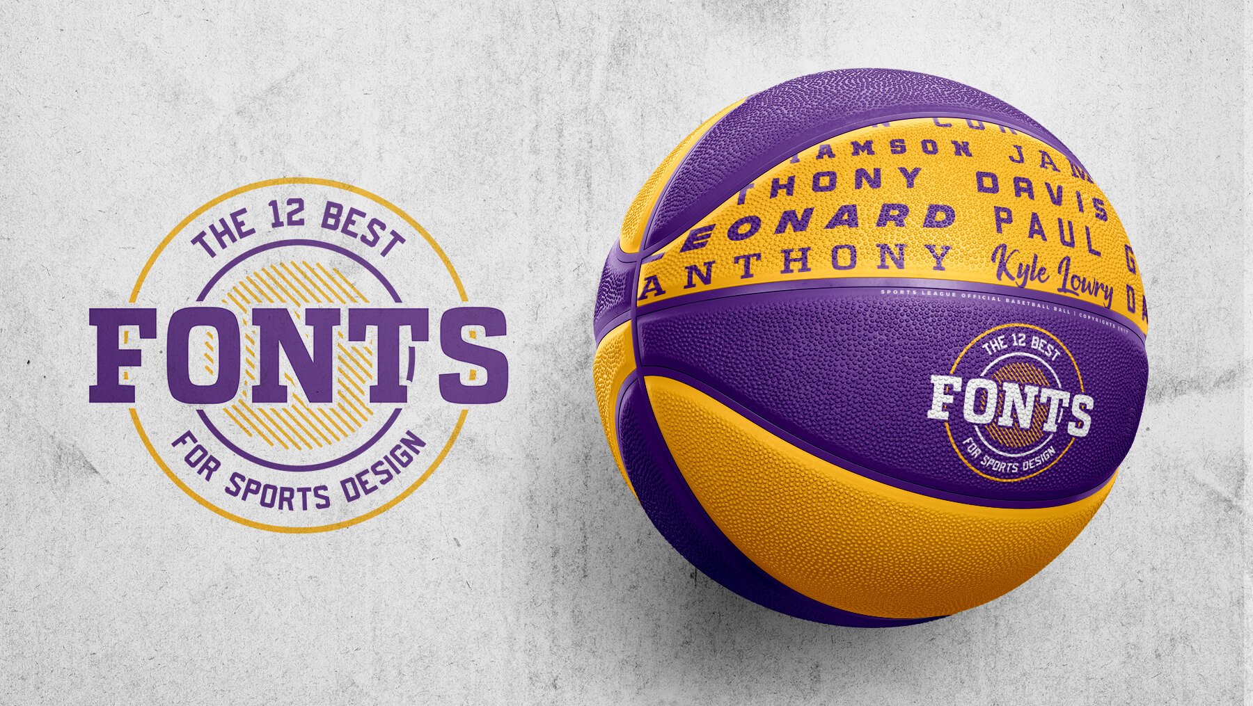
Uniform design in sport is not solely about the colors, patterns, and logos being thrown together to create the perfect combination; selecting the right font can be the cherry on top of a stellar design.
There are literally hundreds of fonts out there at your disposal, but subtle differences in style can make all the difference in design, so it’s important to think closely about what you’re looking for.
Different fonts are available in different styles (such as regular, bold, vintage, italic, etc). It’s essential to pick not only the font you desire, but also ensure the style you’re looking for matches the rest of your design.
Let’s dive in and take a look at some of the different fonts available.
Paid Fonts
1- Predator 0316- Sans
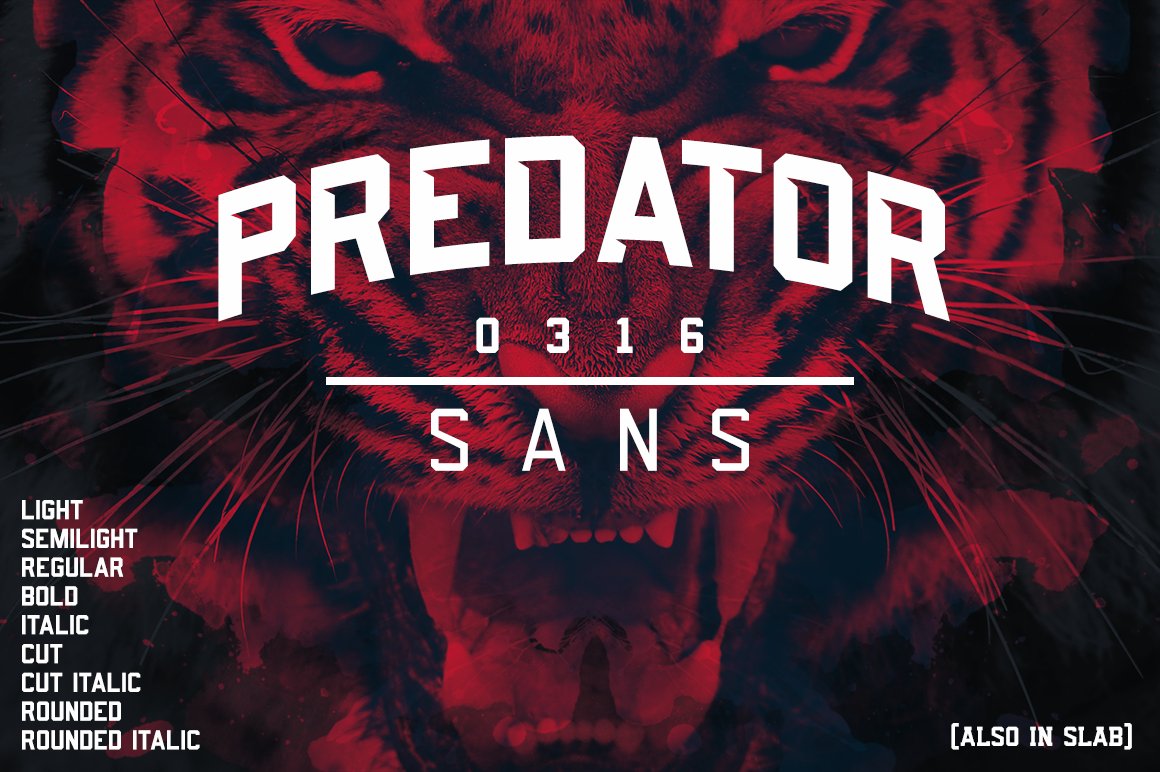
This impactful and striking font by American Eargle is available in a plethora of different styles (see lower left of image). If you’re looking for a font that showcases modern design, Predator 0316 Sans could be the style you’re looking for.
This font is a great choice for logo design as it stands out and in our opinion gives an aura of intimidating competitiveness.
2- Redzone Classic

Redzone classic by Zilligen Design Studio is a great font built specifically with sports branding and similar projects in mind. The font features sharp edges that really help it put out a feeling of aggressiveness or competition—perfect for your team logo or jersey lettering.
With a plethora of characters to choose from, Redzone Classic will really help drive your design with the competitive edge you’re looking for.
3- Triton
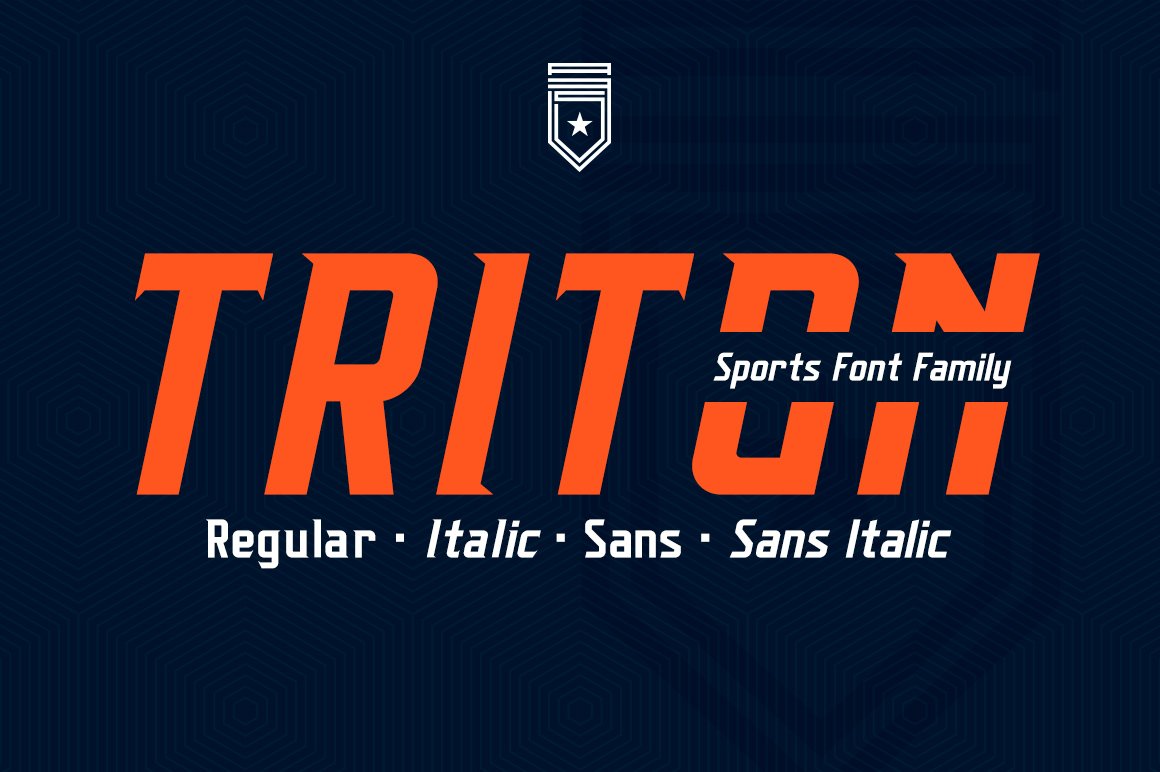
The name says it all. This powerful and energetic font by ANDR35 is designed with the sports industry solely in mind. Triton is designed around working well on sporting jerseys and its unique shape and sharpened edges could really tie a stellar jersey design together.
Inspiration for the font comes from Nike’s recent NCAA/NFL type fonts, and with the ability to also include punctuation, the font is versatile enough to be used for additional pieces such as social media, ads, or game programs.
Triton features 4 different styles—regular, italic, sans, and sans italic.
4- Integral CF

Integral CF by Connary Fagen is a bold and striking font that evokes a strong level of competitiveness and makes an impact perfect for sports ads, social media, and especially headlines.
The strong and rugged edges of Integral give this font a rugged yet authentic look that can lend a design confidence. It features 6 different weights and obliques and arrives in a titling/all caps design.
5- Curveball Vintage Typeface

There’s just something about nostalgia that really grabs peoples attention. Sure there are a ton of fonts out there that are powerfully modern, but if you’re looking for the classic touch of a golden oldie, look no further than Curveball by American Eargle.
If you want to take a trip back to when the stitches popped out of balls while turning a few heads, Curveball will give you the dramatic vintage look you’re going for.
Curveball comes with 6 different font styles to appeal to a wide range of designs.
6- Buinton

Buinton by Mika Melvas is a script typeface that provides a vintage look on a modern style typeface. It features a formal design with serifs at the beginning of strokes.
Well-suited for logos, lettering artwork, jersey designs, and sports ads, the impact of Buinton is sure to help fire your design to the top.
7- Arena

Arena as its creators “Type Drift” put it “is a solid block font built for a sellout crowd”, This is a perfect font for a logo design especially if you’re looking for something unique and distinct.
Arena comes with 3 different weights —regular, Bold, and light.
Free Fonts
8- Jersey M54
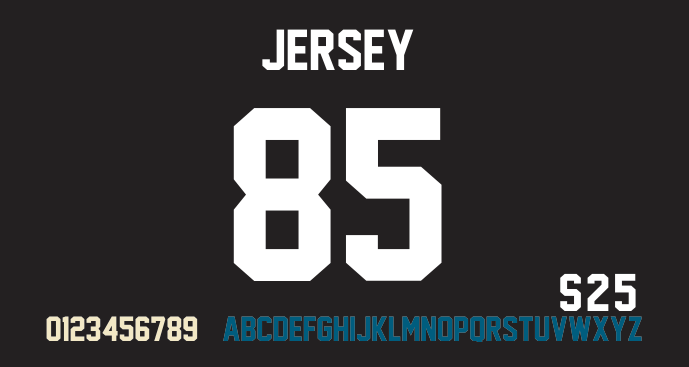
Jersey M54 is a classic and rugged font perfect for apparel design and the numbering and lettering on sports jerseys.
The curve-in edges of this font help to give it a compact yet distinguishingly rough design that enables it to maintain an intimidating, competitive look.
9- Old School United
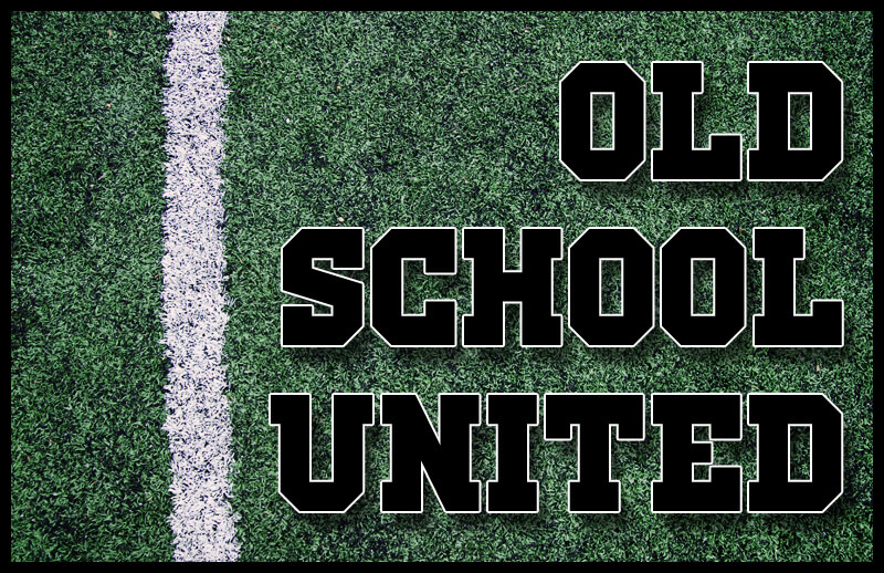
Old School United is a classic touch on a bold and striking font that gives off the jock image you thought you left back in high school.
Available in more than 10 different languages, the font has a style that appeals well to sporting ads, social media, and potentially a classic refined touch on jersey lettering.
Grab this font to create a blast from the past that will help drive your design to the top of the league.
10- Varsity

The name says it all. Varsity is a free font specifically created with sports design in mind.
If you’re looking for a classic style to get those names on the rear of your jersey, Varsity might be the font on a budget you’ve been looking for. Featuring a classic look that can help sports ads and lettering on jersey design really stand out.
11- Atletico
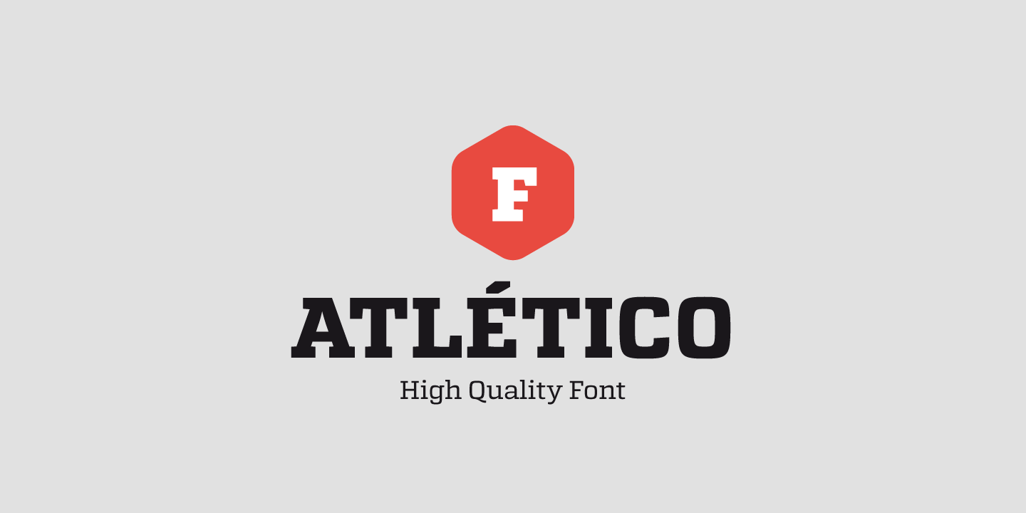
Atletico is a font that arrives in 6 different styles. With the versatility to choose between thin, ultralight, light, regular, medium, and bold, Atletico is one of the best fonts you’ll come across with budget in mind.
Creating a perfect blend of curve and straightedge, Atletico is a font that works beautifully with jersey design and lettering.
The versatility of this style also gives it the ability to work well with social media and sports headlines looking to make that extra impact.
You’ll be hard pressed to find a more attractive font that won’t cost you a cent.
12- Claymale

Claymale is a wonderful free font that combines the elegance of a cursive style with a bold impact.
The curved edges and elegant style of this font make it a perfect choice for sports logo design.
If you’re looking for a touch of class without breaking the bank, Claymale is a fantastic choice for getting the job done.
Font Making an Impact in the World of Professional Sport
Think of your favorite sports team. What makes them recognizable over your rivals? Sure, different colors and emblems are what makes them stand out but these designs are largely indistinguishable without the touch of a unique font to help them rise above competitors.
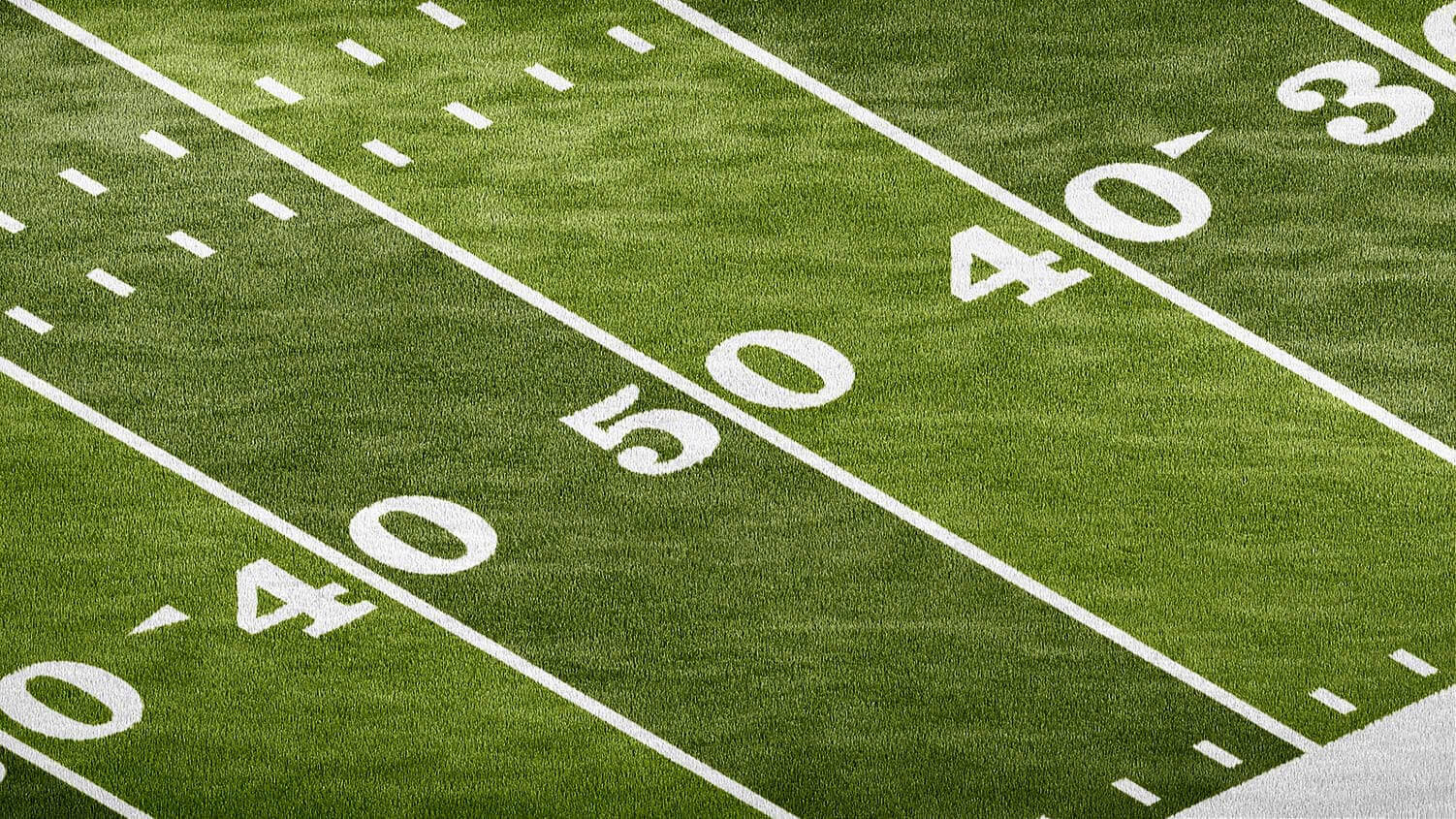
Field and court markings are most prevalent in American sports. American football fields in the NFL are covered in font to lay out the numbering specifying the yard lines across the field.
Is this font specifically created with the NFL and its fans in mind? Absolutely. You can check out this font here.
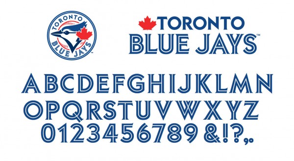
The NBA is another organization that uses a custom font to resonate with its audience. Try to imagine how the image of these organizations would change if they used a common font.
That’s how important it is to select the right style for the design you’re looking to create.

Fantastic Fonts
So there you have it, the 12 best fonts available to you today. Selecting the right font doesn’t necessarily mean you have to pay for it, but it’s essential to the rest of your design that you select the one that matches the goal of what you’re looking to achieve.
So get out there, pick your font of choice and create a design fit to conquer the world.