
Top of the league in design
Soccer today is not what it was yesterday. The game has seen some remarkable changes over the past 2 decades, and the English Premier League has been at the center of this evolution.
With the evolution of the sport, has come the evolution of the fashion and practicality of the uniforms being worn by players. The EPL showcases the best players on the planet, and of course if you are the part, you will want to look the part―so fashion is a big factor of the changes in uniform throughout the years.
The English Premier League is viewed in almost every single country on the planet. Players taking to the field are seen by eyes spanning every corner of the globe, so fans are certainly taking note of what the players are wearing.
However, simply looking the part means nothing if a jersey doesn’t have the performance to go with it. The balance between both these traits is what has shaped the evolution of jersey design over the years.
Let’s dive in and have a look at how things have evolved from then to now.
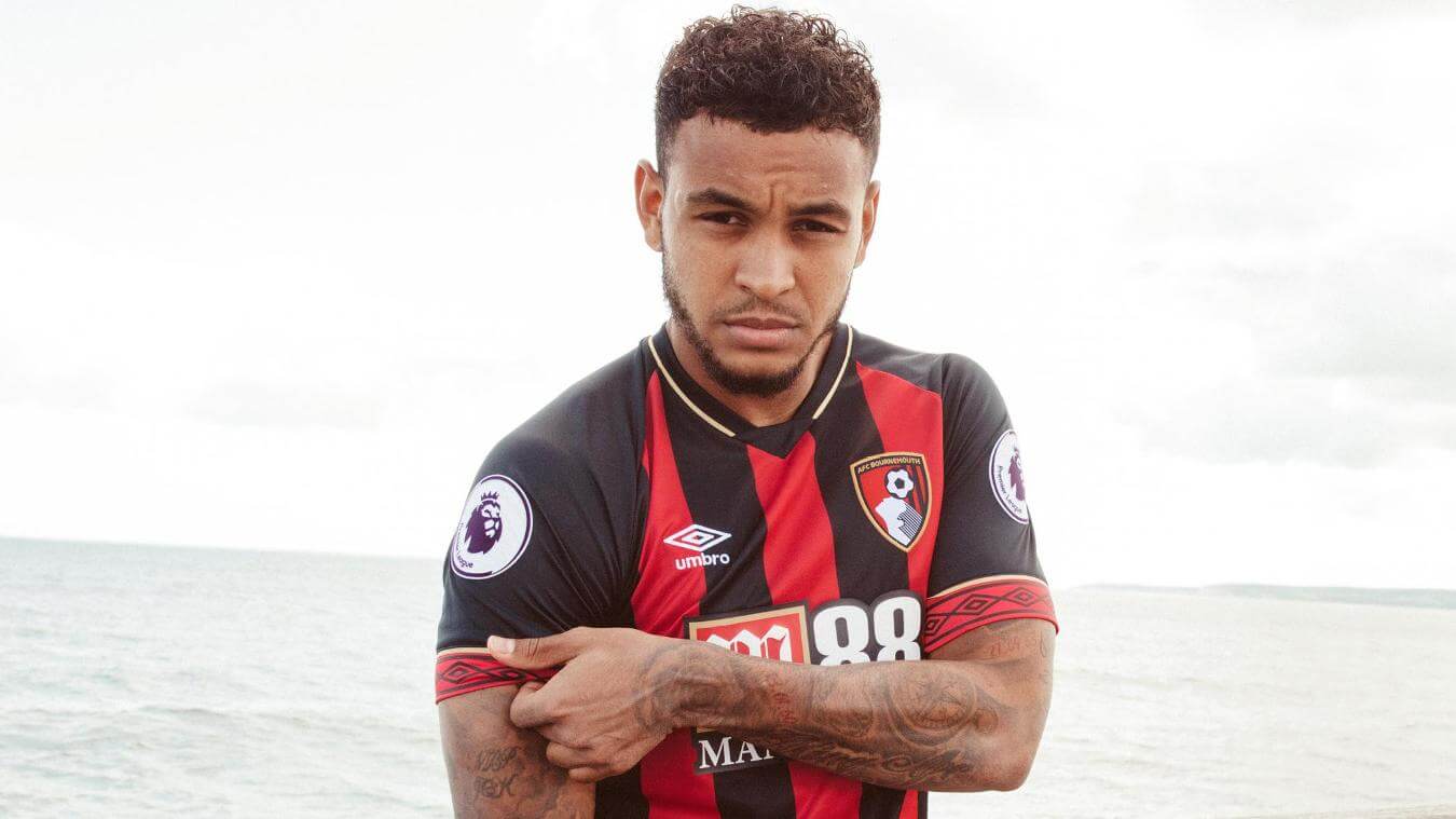
Perhaps the most noticeable change in jersey design comes in the fit. The game has evolved to be much faster and aggressive and jersey design has followed this evolution. Players back in the early seasons of this century were wearing much looser fitting jerseys. To prevent shirt-tugging and keep up with the rigors of the modern game, things are a lot more snug nowadays. While this trend certainly keeps up with the trend in modern fashion, it also means less of a headache for players and especially referees.
Fit is essentially the most important aspect of the evolution of jerseys in the EPL, and we’ve put together a fantastic template blending fashion and fit right here.
So the fit has changed, but what about the design?
It’s very important for a franchise or smaller club to maintain their image and reputation on a global scale. Important for marketing, supporter rapport, and overall reputation. Due to this truth, EPL franchises haven’t made huge adjustments to their colors or crests in the last 20 years.
Fold-over collars have become less popular in recent seasons but can still look great if blended well with a more classic jersey style. What we see today is mostly a collar design that fits tighter around the neck and chest area to create a more symmetrical design with the shirt. Check out this template to have a look at how this design can look for you. I

Chelsea—another major player in the EPL adopts a similar collar style in their 2019 jersey. Similar to the collar-cut of Adidas but slightly less V-shaped and a more relaxed open feel. This style gives extra breathability around the neck and chest area and aids in the maneuverability of the upper body. A great design with the speed and agility of the modern game in mind. This template features Nike’s unique cut. This Nike design features seamless sleeves that work all the way up to the collar. This design also contributes to a more relaxed fit, meaning less fabric resistance on the upper body and ultimately better breathability compared to other designs.
Same passion, new brand
The Premier League rebranding meant a redesigned logo. This logo has to be included on the sleeves of players advertising the league. Having your patch included on the sleeve of your jersey means it’s instantly recognizable and great if you have a large audience and want to advertise the league or competition you’re competing in.
It’s not only jersey design that has evolved in the Premier League. Beginning in the 2016-2017 season, the Premier League rebranded its design to be more recognizable across the globe.
In design today, many brands are adopting sharp colors, curved edges, and stand-out visuals to have a stronger impact. The Premier League followed this trend by rebranding to a design that uses bright colors and a more stand-out visual to match the high octane, emotion-driven, and insatiably competitive atmosphere of what happens on the pitch and in the stadiums surrounding it.
The old logo was less aggressive in terms of color and certainly didn’t maintain the pop culture driven flavor of the logo we see today.

The rebranding in the Premier League meant that the official ball had to be changed to show the new logo as well as the display on pitches up and down the country.
Does your brand stretch as far as logo design to go hand-in-hand with the uniform? This template allows you to implement your brand on a field or pitch.
If you want your match ball to look the part and feature your brand, we also have the perfect template for you here.

Design to shine
No matter what you’re designing, it’s highly important that functionality and fashion are both taken into consideration. This is very important not only out on the soccer field, but across all sports, so when designing, try not to drop the functionality aspect of your design because you’re focused on making that catwalk appearance.
Jersey design in the premier league will continue to evolve and it will be interesting to see where things go in future seasons. Sports Templates will be there every step of the way to ensure our templates keep up through these exciting transitions.